New Blog Design!
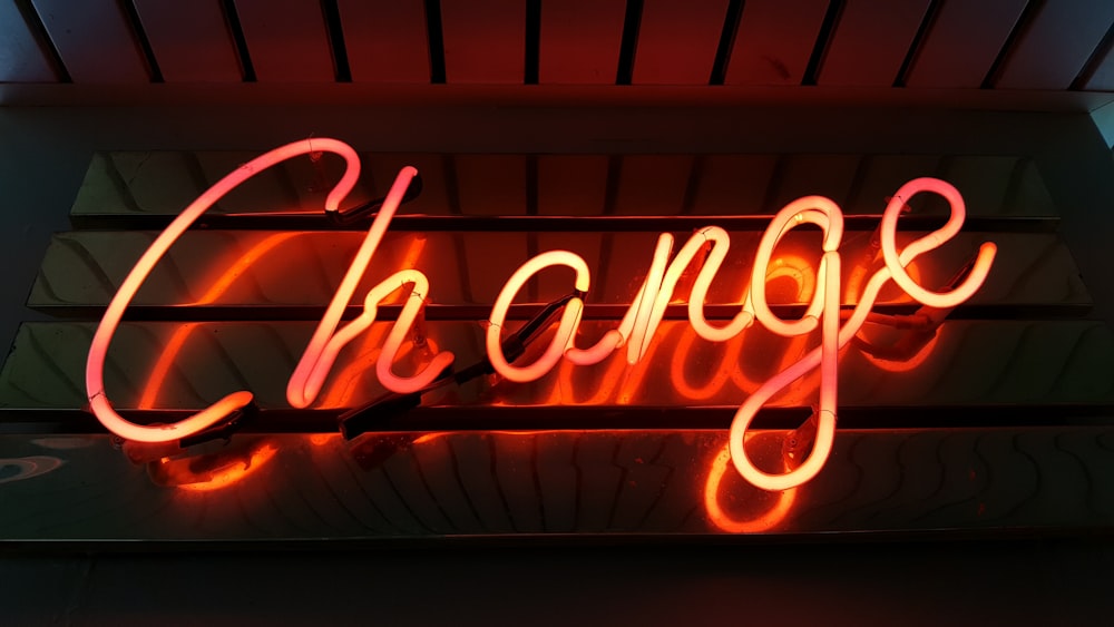
The theme is a big change, I know, and I feel that overall the site is a little bit slower to load. However, what the design lacks in speed, it makes up for in appeal!
Do you like the new design better or worse? Let me know with a comment below! If you find any glitches I would also love to know!
Finally, don't forget to comment on posts and subscribe to support the author. Thank you!
Edit: Wooohoo! I figured out the glitch on the comment section! :D


4 comments
THIS BLOG THEME IS INCREDIBLE
ReplyDeleteI MEAN
WHAT
HOW
I KNEW YOU WERE GOOD BUT NOT THIS GOOD XD XD XD
XD XD XD Thank you!!! It took some fiddling, but I finally got it working! Who knows, I might redo it again in a year or two... XD
DeleteI love it! The flames are epic and it is so gorgeous!
ReplyDeleteThank you so much! I really appreciate it :D
Delete